SKINCARE THAT TRANSCENDS TIME
Neferte
INTRODUCTION
Neférte originates from the Latin root word forte, which essentially means “strong” or “bold”. Our brand was built with your skin’s strength and resilience in mind, and on the concept that every skincare product you use should be made with pure and powerful ingredients.
Strategy
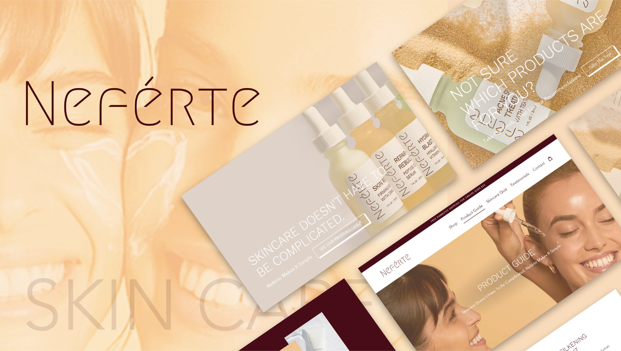
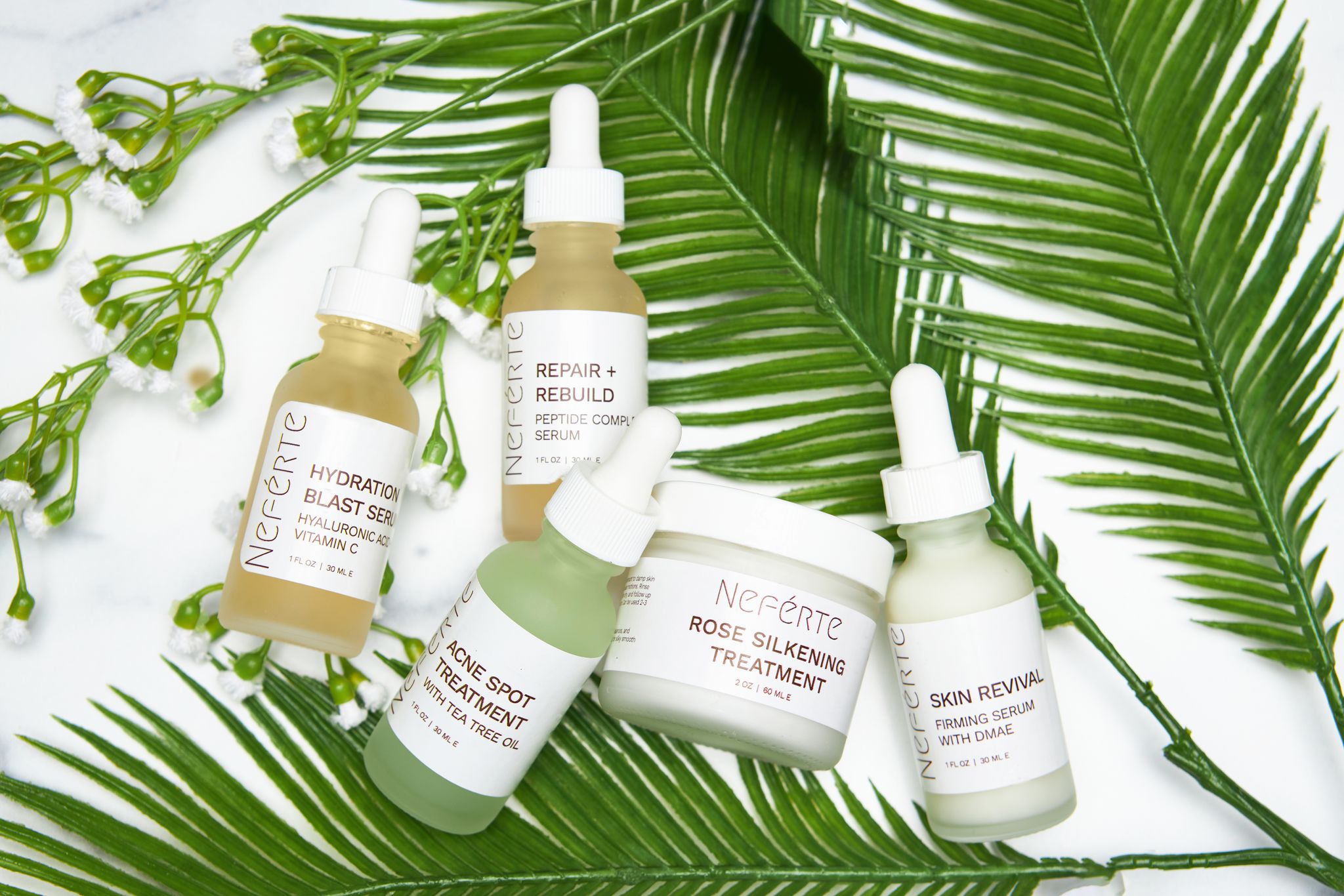
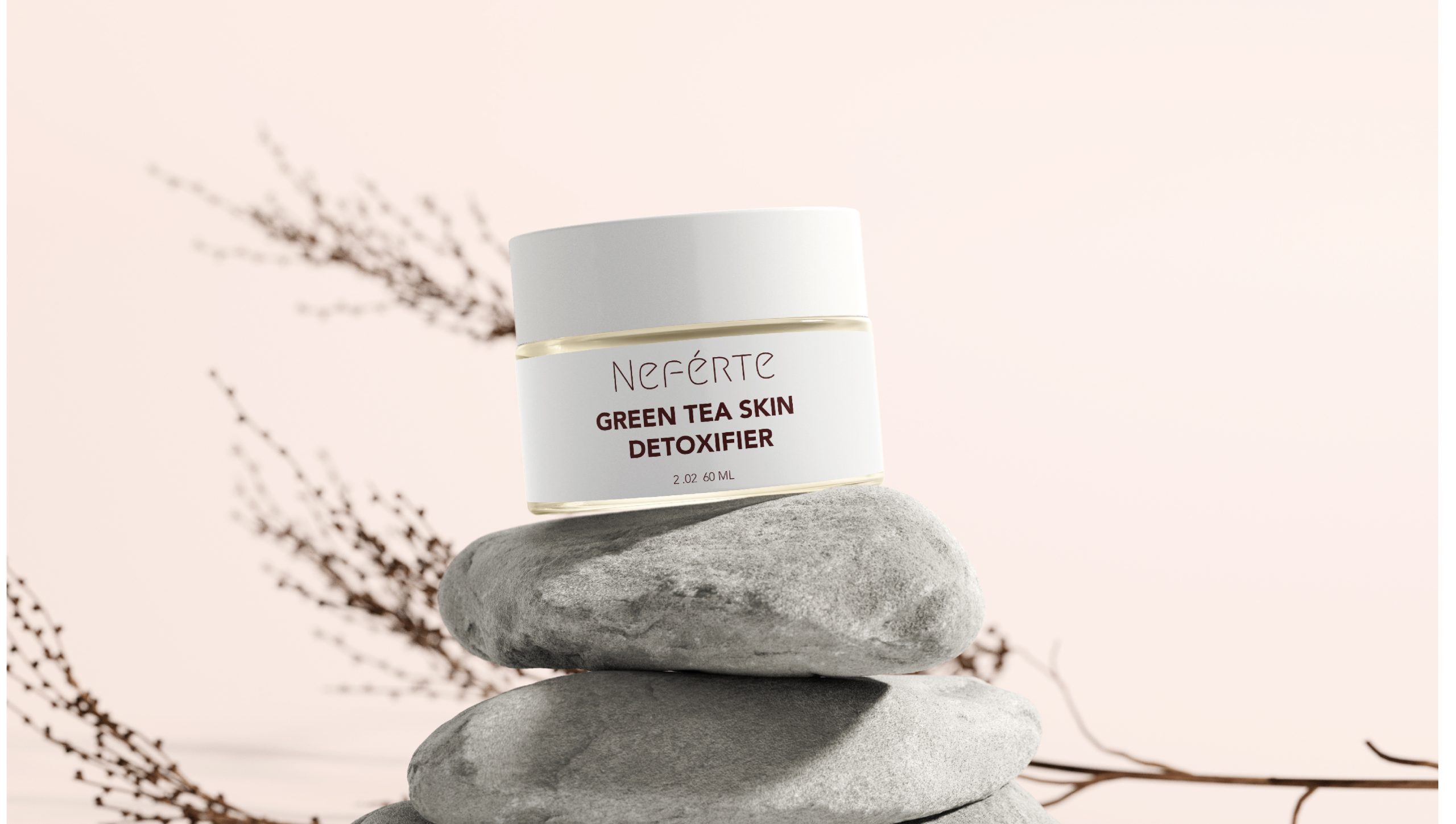
Customers need to feel the vibe of Neferte immediately upon visiting the website and they should be able to determine what product is right for them and why. Cohesive, aesthetic, and minimalistic packaging that clearly informs the user of the product. The packaging should flow and complement each other, and revised the cleanser box design to fit in with the new serum and scrub packaging boxes.
Challenge
Neférte is a unisex, multiracial, modern skincare brand, built upon the notion that natural healing properties of the Earth is all that is needed to resolve your skin’s most persistent concerns; everything from scarring and discoloration to acne and premature signs of aging. We want to portray in our branding what we are striving for.
Solution:
Customers view this brand as trustworthy and unique, as well as very credible and effective. The company is real, honest, and meticulously crafted. We aren’t afraid to show skin texture and “imperfections” of skin in their media, and we focus on why their products work, not just how trendy or cool they are.
